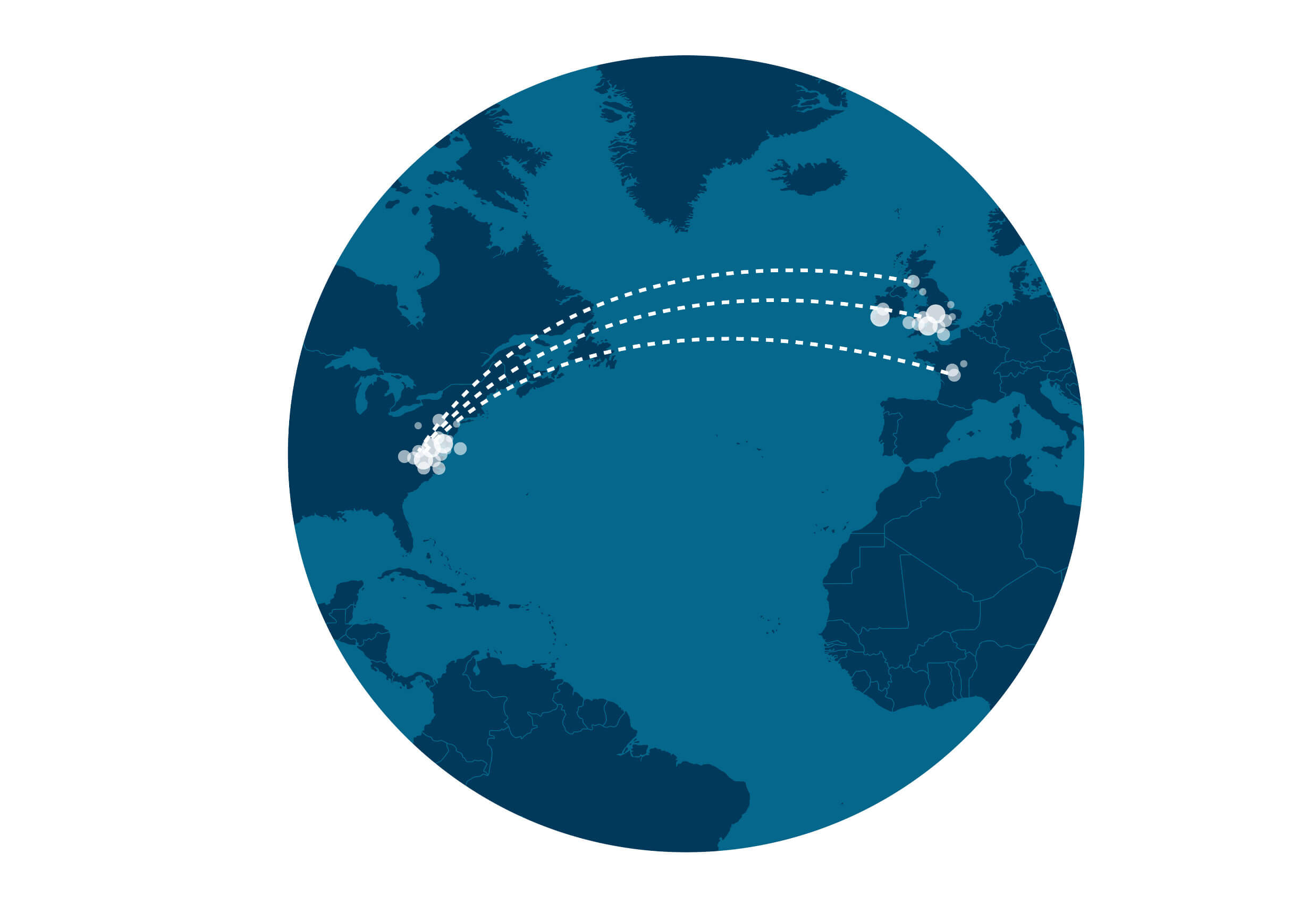
The dots represent ancestral birth locations. We collect birth locations and dates from online trees that members of communities have linked to their AncestryDNA results. We remove locations that are not statistically significant or relevant to a community. Then, based on that data, we create maps with large and small dots showing population density at different times.
We use the same data to track migration patterns by comparing birth locations between parents and children. These are reflected by the lines on the map. By looking at changes in migration paths over time, we gain more insight into where and when people moved.
You'll notice the dots change with the time periods. Each dot represents ancestors born during that time. A dot in the middle of a state or country that doesn’t seem to correspond with a population center represents people in trees who had only a state or country listed as a birth location.